We started off playing with Tyvek - that plastic stuff they wrap houses in before putting on siding. It got painted with Lumiere paints, then you place it between parchment paper and heat it with an iron and it gets all bubbly and the colors intensify. Depending on which side (painted or not) is up, you get bubbles or craters. The fish below is 3 pieces; the fins were odd shapes that shrunk like that on their own. I did a little "surgery" on the fish body (the tail fins) to get the shape I wanted. These are 3 separate pieces, but can now be glued or sewn onto whatever base I want to use.

We did a lot with the Lumiere paints. In the next image, fusible web was painted with Lumiere and when it was mostly dry, ironed onto fabric. I had one large piece of fusible web, painted with blue and blue-green, and cut it in half. You can see how the background color makes it look bluer (on the white fabric ) and more silver (on the black fabric). The bits that peeled away were still wet when ironed, which could be used as a deliberate technique for making something look distressed. But I'll have to be careful to place parchment paper over them if I have to iron them, unless I want to glue my iron to the ironing board!

This is lumiere painted onto steam a seam fusible web that had been pre-wet. The pre-wetting helped the paint colors run together. It was ironed on wet. The left side of the image below is the painted fusible web - bright and shiny. However, I ended up liking the back side even more - some of the paint came through to the back, giving a subtle shine in organic shapes. I think it would be great for backgrounds.

We also played with diluted Lumiere. I took a bit of my plain white fabric and dipped into diluted purple paint. The shine remained, but I over-diluted it and it was a barely there lilac color after wringing out the fabric. So I added a few globs of teal and purple and smooshed the fabric all around and ended up with this. I'm currently using it as background fabric for some digitally-printed images.

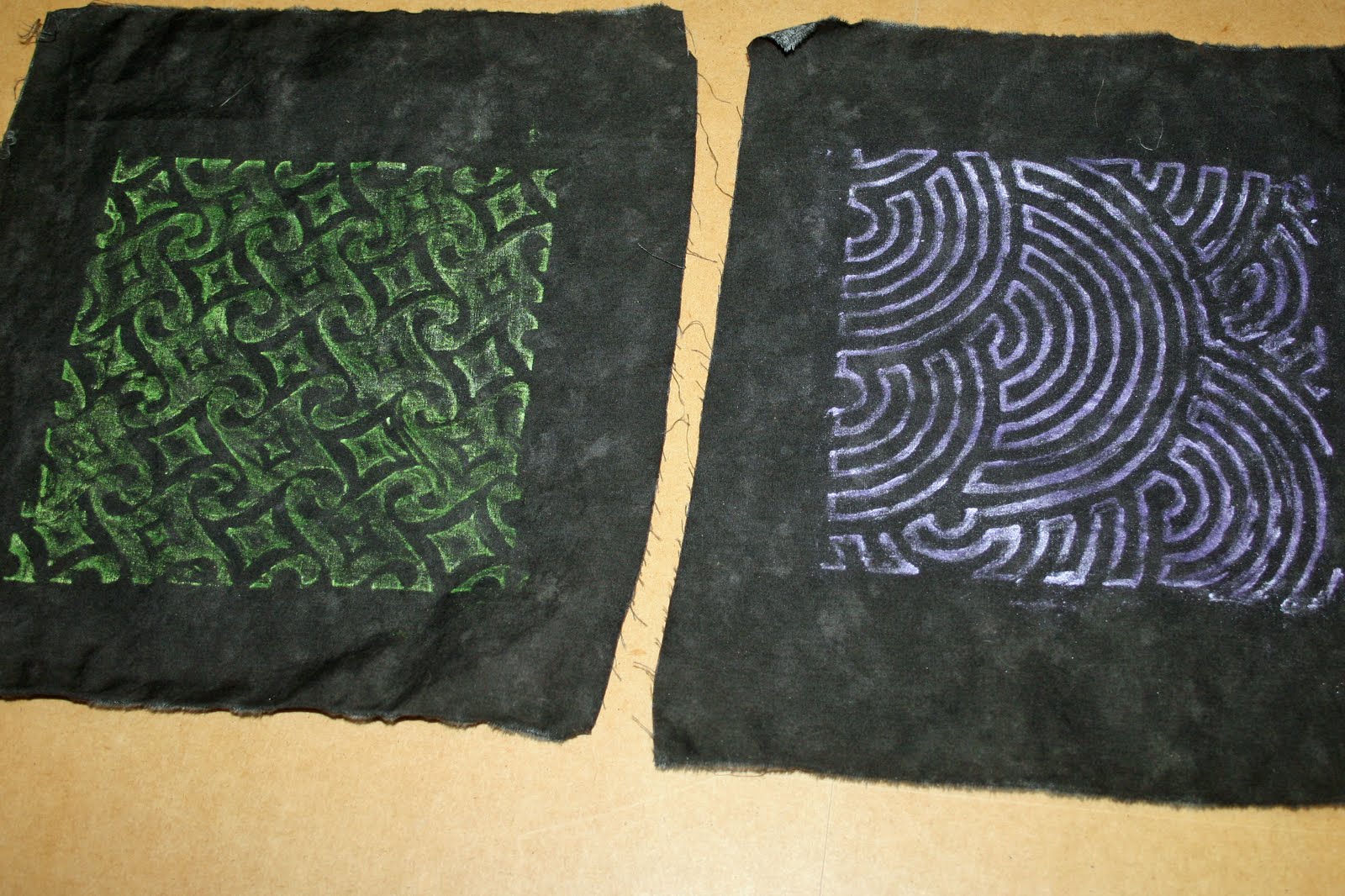
We played with Shiva sticks too, using them on top of templates. I was boring and just did one color per plate. Some of the more adventurous gals mixed a bunch of images and created their own multi-patterned fabrics.
And here is, hands-down, my favorite piece of the day. We used Caran d'ache Neocolor crayons directly on the fabric to color an image, then used water and paintbrushes to paint them out. I am not practiced at drawing, but I do know (thanks to the inspiration wednesday videos that Donna Downey posts on her blog) how to draw a poppy. So I did that with purple crayons, and gave them a gold/orange background. I'll be quilting this piece and hanging it in my office/sewing room because it's just so bright and cheerful.


No comments:
Post a Comment